Practical Ways To Use Ultra Violet In A Family Home
As 2015 drew to a close, whilst the last of our gifts were wrapped and our hearts were merry, our Pinterest boards were spilling over with the announcements of Pantone's colour of the year for 2016 - not one but two shades had been selected. You couldn't open a magazine or switch on the TV or open up Facebook without seeing the words Rose Quartz and Serenity they were everywhere - from soft furnishings right down to nail varnish.
Just one year on, the colour of 2017 was Greenery - personally I loved this vibrant, bold, striking green but the trend just didn't seem to take as much as Rose Quartz and Serenity and when it comes to interiors, bright green takes much more confidence than the calming pastels of the previous year.
We all like to take our inspirations from trends and predictions and Pantone colour of the year has such a depth of influence not just for our interiors but for fashion and beauty and everything in between.
2018 brings us inventive and imaginative Ultra Violet, it's a bold colour and will need handling with care as it carries us towards the future. As a blue based purple we may have to be selective on how to add in a little warmth and such a visionary shade will be challenging to balance against still trending Hygge - Scandinavian cosiness.
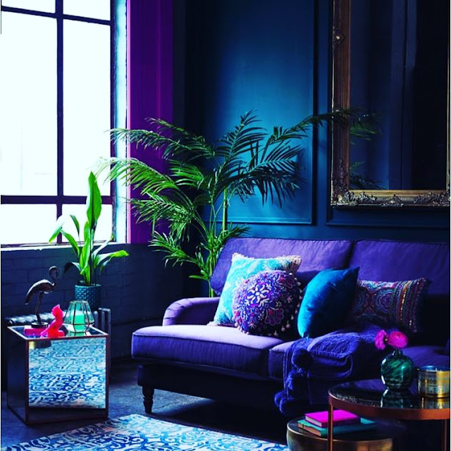
Keeping our dramatic Ultra Violet in mind, this shade will compliment the greys we started to see last year, from a light base grey to a dark grey carrying depth with a blue base.
Drawing on Ultra Violet being historically linked to spirituality and meditation, we can compliment this ingenious shade with cream to create a calming haven.
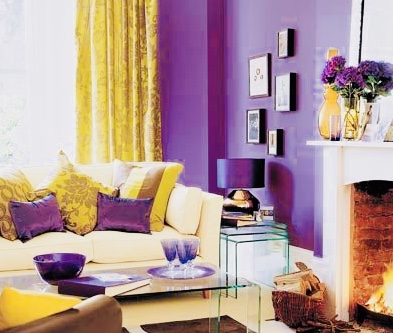
Or we can lend a nod to the regal opulence and party popping purple was see in our idols from Bowie to Hendrix and of course Prince - we can clash this colour perfectly with vibrant red and the brightest yellow.
Have you introduced Ultra Violet to your home yet?
Emma
Little House Lovely
#LittleHouseLovely
 |
Just one year on, the colour of 2017 was Greenery - personally I loved this vibrant, bold, striking green but the trend just didn't seem to take as much as Rose Quartz and Serenity and when it comes to interiors, bright green takes much more confidence than the calming pastels of the previous year.
We all like to take our inspirations from trends and predictions and Pantone colour of the year has such a depth of influence not just for our interiors but for fashion and beauty and everything in between.
2018 brings us inventive and imaginative Ultra Violet, it's a bold colour and will need handling with care as it carries us towards the future. As a blue based purple we may have to be selective on how to add in a little warmth and such a visionary shade will be challenging to balance against still trending Hygge - Scandinavian cosiness.
Keeping our dramatic Ultra Violet in mind, this shade will compliment the greys we started to see last year, from a light base grey to a dark grey carrying depth with a blue base.
Drawing on Ultra Violet being historically linked to spirituality and meditation, we can compliment this ingenious shade with cream to create a calming haven.
Or we can lend a nod to the regal opulence and party popping purple was see in our idols from Bowie to Hendrix and of course Prince - we can clash this colour perfectly with vibrant red and the brightest yellow.
Have you introduced Ultra Violet to your home yet?
Emma
Little House Lovely
#LittleHouseLovely


Ive just added Ultra Violet seat cushions to our kitchen chairs and matched it with a table runner and place mats, it makes for a very cheerful breakfast time. Love bright colours but I'm never brave enough to go beyond a few easily replaced accent items wish I dare paint a whole wall
ReplyDelete